Well, I'm finally going to finish up this Wasatch High Principle series I started last year and have an appointment to photograph the last and current principle tomorrow. It's been kind of tough. The reference was much less than adequate, most of the photos being about an inch and a half big out of
80 year old yearbooks. Most of them were lit directly from the front which makes the subject appear all but completely flat which required me to take a few liberties while trying to come up with a decent likeness. While I really struggled with some, there were others that went smoothly and turned out really well. Especially considering that, for the price, (which I'm embarrassed about) I could only afford to spend a 2-3 days apiece on them. Here's a few...
 |
| This one was the first I did in which I established the color pallet I intended to use throughout the series. I wanted it to be consistent so that even though they look different they will still go together because the same limited colors were used in each one. |
 |
With only 2 exceptions all the reference was black and white
so I spent a lot of time guessing at the flesh tones. |
 |
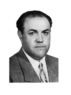
| This was principal Vanwagoner, a firm and not handsome man. |
 |
| this was his reference- a 2"x3" yearbook photo. |
 |
This was my principal back in 1991-Brad Kendal
I was the kind of student that wouldn't have necessitated him having to even know my name. |
 |
| You can see i placed his face in shadow for interest sake. Does it work? eh. |
 |
| This was Dr. Larson. It's unfortunate this was the only suit we had reference of. |
 |
| This was a tough one because his photo was so old and washed out I don't know if it looks anything like the guy. |
 |
| I love how this early principals eyes turned out. |
 |
| Maybe it's the garish colors but I love this one. |
 |
| I think he's better looking in the painting. |
 |
| Interesting note: the undercoat and background of all these is made up of the same two colors:transparent oxide brown and sap green in different ratios. Some like the "garish" painting above have mostly the brown and less green, others like the one above less brown and more green. It's impressive how many variations you can get with a very limited pallet. |


No comments:
Post a Comment